Elysian Brewing Company: Website & E-Commerce Redesign
My goal was to redesign the website and e-commerce experience to improve the target users experience and align it with Elysian Brewing Company’s business aims.
The client
Elysian Brewing Company
My role
UX Designer (end-to-end)
The project
Website and e-commerce redesign

Project duration
2 Weeks
Primary persona
Lauren Berlinger
29 year old Script writer.
Scope
User interviews
Ethnographic research
Comparative analysis
Storyboard
Interaction design
Information architecture
Site map
Lo-Fi prototype
Usability testing
Tool
Pen & Paper Whiteboard Sticky notes Sketch
iMovie
Card sorting
Affinity mapping
I was tasked with redesigning the Elysian Brewing Company’s website and e-commerce experience. It was first important to validate the client provided persona through qualitative research and understand how the Elysian Brewing website can better meet the target users needs.
The challenge
Through qualitative research, usability testing, and design iteration, I simplified and streamlined the Elysian Brewing Company website and e-commerce experience.
Results
Elysian Brewing Company is a Washington grown brewery that operates four locations in Seattle. Since it was founded in 1995, Elysian Brewing has grown and in 2015 it sold a 25% share to Anheuser-Busch. No longer able to meet the Brewers Association definition of craft brewery, Elysian has lost its standing as a Seattle craft brewery. This set Elysian up for nationwide distribution, but had a negative impact on its local standing.
Background
Persona
My client provided me with this Persona, Lauren Berlinger as their primary user. The first step in my research was to validate that Lauren is in-fact the primary user based for their business goals.
Lauren Berlinger
“It’s not whether I can afford it, it’s whether I can afford NOT to have it!”
Pain Points
Lengthy checkout process
Wants to be sure of small product details
Missing out on exclusive items
Poorly written website copy
Tech Empathy: High | Purchase Cycle: High

Lauren Berlinger
29 year old Script Writer
How we can serve
Characterful copywriting
Efficient checkout process
Multiple/Large product photos
Ability to submit reviews of products
Research methodology
User interviews
I conducted user interviews to explore the user experience at Elysian Brewing in Capital Hill. I wanted to explore their behaviors, habits, and reasons why they use the Elysian Brewing website. This uncovered many interesting trends, such as, using online ordering for beer pick-up.
Usability testing
I conducted usability testing to first establish a baseline experience of the current Elysian Brewing site and e-commerce checkout. This allowed me to understand the users thoughts, feelings, and experiences of the original site and establish some pain points. Once I created a functioning prototype I continued with four rounds of usability testing to inform my design decisions.
Research overview
My first step was to validate the client provided persona through User Interviews. Explore how the business goals and pain points can be realized through a more intuitive checkout process. Then talk about how I measured my success in simplifying the user flow and meeting user needs I tested my design changes with both direct customers and tangential customers.
My exploration began with the Elysian website and Yelp reviews. I wanted to get an idea of the brand and its role in Seattle brewing culture before I started my field research.

I started with an ethnographic bend to my research and I visited Elysian Brewing in Capital Hill. To establish a sense of the business and get a chance to speak with the customers. I utilized qualitative research methods such as ethnography, user interviews, and usability testing. My goal was to get to know more about the behaviors and history of individuals who work at the brewery and the customers who come into the brewery.


User interviews
After I finished my interview with the manager, I asked if I could chat with some of the customers that were present that evening. She gave me permission as long as the customers said yes and felt comfortable.
“I am a Manager at the Capitol Hill location and have worked at Elysian Brewing for 16 years!”
I took my beer and walked up to them and introduced myself. I allowed the customers to guide the conversations and questions. Mostly, I asked five-ten questions, trying to focus around their background and general experience.

During my time talking with the manager at Elysian it became evident that the Brewery had a lot of goals it wanted to achieve, which would inform my redesign choices. It was clear that although the brewery is making a lot of money on a national level, it took a serious hit in the craft beer culture of Seattle.
Elysian Brewing is a local brewing company that gained national distribution in 2015.
Elysian has produced up to 663 beers since they opened in 1996.
Although Elysian produces at about one new beer weekly, they have lost their name in craft brewing. This means that they have new goals for reinvigorating their brand amongst Seattleites.
Business objectives
These are four of the top business objectives that Elysian Brewing wants to achieve.
Regain trust
The business objective is to attract the local Seattle crowd and regain their trust as a craft brewery.
Thinking local
Convince Seattleites that Elysian Brewing is still thinking local even when though they have gone national.
Seasonal and experimental beers
Focus on seasonal and experimental beers.
Up-to-date website
Keep its website up-to-date to minimize confusion and disappointment.
Participants
I conducted five user interviews with individuals who were spending their evening at Elysian. I wanted to know what they enjoy about breweries and what it is about Elysian that brings them there.
Participants
A total of 16 users participated in interviews and usability test sessions. I utilized one Elysian manager with 16 years of experience at the company, five direct customers that I spoke with at the brewery, as well as 10 fellow classmates and one industry professional, who had either tangential brewery habits or enjoyed Elysian brewing directly.
Persona development
Although the user interviews validated that Lauren Berlinger is a primary user and persona, it is clear that it would be very valuable to develop at least one more persona. This would allow Elysian to better align its vision with families that visit the brewery for social time and event veterans who use the website to learn about Elysian’s community events or buy swag. It would be very valuable to tap into this previously established user base and anchor the beer for pick-up to already established user habits.
To better understand and synthesize my research I created an affinity map from the five customer interviews I had conducted.
Affinity mapping

Affinity mapping helped validated that the client provided persona, Lauren Berlinger lines-up with the business goals and objectives and is in-fact one of their primary users.
The main points I got from my user interviews:
“I need online order options”
“I like to go to breweries to try new selections”
“I go for the special beers”
“I need it to be convenient”
“I need to look for events”
“I need it to be timely and want updates”
“I don’t know where to learn about it”
“I need to have beer to go”
“I have to trust the brand to order online”
Problem statement
Solution statement
Lauren needs a way to reserve and buy Elysian Brewing’s exclusive craft beers online because otherwise she will miss out on their unique weekly batches.
I designed an online system to order for pick-up experimental, seasonal, and specialty beers which assures Lauren won’t miss out on exclusive opportunities.
We believe that by creating an online system to order for pick-up weekly, seasonal and specialty beers for Lauren we will give her the opportunity to try our new brews on her own schedule without having to fear she will miss them. We will know this to be true when the checkout metrics of our seasonal, specialty and weekly brews registers increase in sales.
Hypothesis
I created a scenario to demonstrate Lauren’s emotional arch in learning about and using the Elysian brewing online order for pick-up so she never misses and exclusive beer.
Storyboard

Competitive
analysis
To explore the main competitors of Elysian Brewing I wanted to look locally and nationally. This was important because there were very few breweries in Seattle that had national distribution. One of Elysian’s main competitors is Ninkasi Brewing Company from Eugene, Oregon. They also have national distribution and have continued to operate their craft brewing agenda. They have kept true to their brand styles.
Ninkasi Brewing Company is an important direct competitor.

Landing pages comparison
Competitive analysis for brewing companies.

As Elysian wants to establish it’s craft brewing name in Seattle I wanted to also examine the other brewing competition that would share customers. There are a lot of craft breweries in Seattle so I selected the breweries that were both close in local and popularity to both tourists and locals. Examining which breweries had been mentioned in the news or mentioned by local bloggers.
Task 1 - Find a piece of clothing that you like and purchase it.
Task 2 - Where would you expect to find information on Beer to GO?
Task 3 - Can you show me where to find the business timeline?
Task 4 - How would you find a contact haze in a store near you?
Task 5 - Tell me where you would expect to find information about their hours?

Elysian Brewing item page.
Once users started the process of selecting an item they felt overwhelmed by the form fields. Four out of five users asked for help and only one user actually made it through the check-out process.
For the comparative analysis, I chose Whole Foods, Starbucks, and Sweet Greens, because they are companies that have already implemented an e-commerce model that allowed for customers to order online for pickup. Lauren would also most likely also use or shop at these businesses.
Comparative analysis

Before I started to breakdown and start a website redesign I first wanted to see where the strengths and weaknesses were in its construction. I enlisted five users to perform five tasks on the original website and had them think out loud as they completed them.
Establishing a baseline
“I get lost and can’t find my way through the checkout!”
Information architecture
After establishing my baseline, I used my competitors websites and comparative businesses to help establish the navigation title language.
Open
I had five user perform open card sorts to explore their mental models.
Once I felt I had synthesized this data and came up with my top navigation.
Closed
After establishing the top navigation I had five new users to explore and understand how users naturally sort the content within the global navigation.
Card sorting

Open card sort
I created a user flow to best understand the decision path Lauren would take while ordering her beer for pick-up. This was created to help build out the navigation and establish where I should focus.
User flow

New site map
I created a sitemap of the original website to best understand how it was laid out and the logic behind its construction. There are a lot of good things about the website that I want to include in the redesign.
I created a new site map to which addressed some of the design issues faced by users in during the baseline testing.

I first sketched out possibilities of what the new pages might look like. This included finding which designs didn’t work. This established the basic layouts I wanted for the different page type in the website. After working out the kinks I jumped straight into lo-fi wireframing in Sketch.
Sketch wireframes


After finishing my first set of wireframes for the website and e-commerce I uploaded them into InVision. This allowed me to link the pages and create a clickable prototype. I set my baseline early on in the project which also assisted in the creation of the next set of task scenarios I would ask users to accomplish.
This task was very specific due to the limitations in the prototype. It was not very helpful to have such a specific task as it limited the user's natural flow and decision path.
First prototype I had five users complete these tasks and took notes and recorded their comments and thoughts. Then I asked any additional questions after they had completed the website.
Task scenario usability testing

Iteration one findings
I made a lot of changes after my first round of user testing. I selected five more users and ran them through the same task scenarios. It was important to simplify the task wording, which yielded much more valuable information about the users needs, pain points, and expectations.
Five users
Three out of the five users found the checkout fairly easy and intuitive, but there were several noted hang-ups. They didn’t know they needed to add the date and time while checking out, because the boxes were not located in an intuitive location. Users also commented that they would prefer a guest checkout option.
Iteration two findings
Five users
Four out of five users found the checkout easy and intuitive, but there were several minor hang-ups. The users didn’t know if their item had been added to the cart and felt that they didn’t expect to be brought directly to the cart page.

Iteration three findings
Iteration four findings
Wireframes and changes
Six users
Five out of the six users found: The checkout remained easy and intuitive, but there were several elements to note and change. The users appreciated the color/value change on the add to cart button. Wanted more information on the confirmation page. They said they might have forgotten where they were going to pick up their beer and not remember the time. They also mentioned that they needed billing info for their card.

Five users
Three out of five of the users mentioned that they really wanted guest checkout options. This was a common declaration over the last three iterations. They said they would rather use the Guest checkout and not have their info saved. I made these changes and added and email section on checkout
Order confirmation page
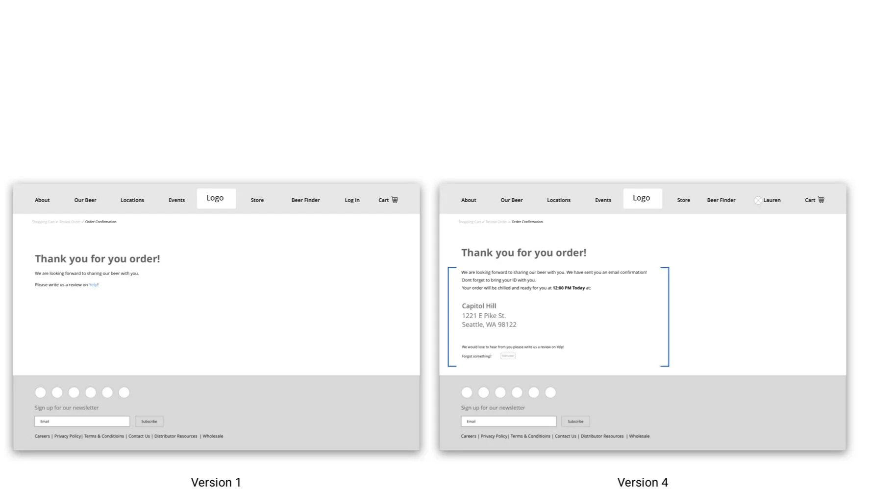
For the Confirmation page I changed the text, added the address and time of pick-up as well as an edit order button.

For the shopping cart page I made four major changes.
1) Moved the date and time panel to beneath the item.
2) I added an ‘proceed to checkout’ button and ‘continue shopping’ button beneath the additional comment section.
3) I made sure to add the number of items in the cart.
4) I fixed the price in the subtotal.

On the checkout page I made a lot of helpful changes due to user struggles and comments.
1) Removed main navigation.
2) Added edit buttons
3) Added an edit quantity button below.
4) Added save address for later
5) Added billing address section
6) Enlarged and added time and location.
7) Removed quantity edit options.

1) Added an X in right corner to allow users to close the overlay.
2) Created a Guest checkout option.
3) Added 21 or older confirmation.
4) Added sign in under button.

When I added guest checkout I needed to add a way for users to receive an email confirmation.
1) Added email on guest checkout page

Product page
1) Created a visual cue on add to cart button.
2) Allowing customers to stay on product page after adding to the cart.
3) Added a continue shopping link so customers can return to beer page to continue browsing.
Next steps
Recommendations
Adding a customer review section for each of the beer pages this will add trust and confidence in the quality of the brew.
Design and add an ordered history page where users can keep track of their beer purchased.
Add a calendar sync option to pick-up so users can easily add their beer pick up into their day.
High fidelity prototype and test two more iterations and then build the website and release it out into the wild where its success can be tracked through analytics.
Reflections
Task creation
It was not very helpful to have such specific tasks when setting a baseline user experience. It limited the user's natural flow and decision path, which skewed the research findings. It is important to have a prototype that can accommodate unexpected user choices.
Surveys and broadening the research
It would have been very valuable to start this project with a survey to cast a wider net around the Seattle area and explore more of the user behaviors and pain points. This would allow for a clearer validation of the client provided persona and allow for the project to be expanded and include more of the intended user base.
The importance of metrics Although this project included a solid base of qualitative research it did not include System Usability Scale metrics, or task metrics, which removed an important part of measuring whether the design changes are in fact increasing ease of use. Moving forward, I would have five users complete three basics tasks and have them fill out the SUS form to establish a baseline with the original site. Then I could move forward with usability testing and design iterations.
Thank you!
City of Seattle
ITSM redesign
UX Researcher

King County Library
Native app redesign
UX Researcher